
Showing posts with label digital apps. Show all posts
Showing posts with label digital apps. Show all posts
Friday, 7 February 2014
3D Camera Projection - After Effects

Friday, 31 January 2014
Stabilising - After Effects

We first imported the original clip into after effects and made a new composition. We then went along the time line to 14fps and made a key frame in the 'position', we then went along to 1 second and made another key frame. We highlighted both the key frames, changed the frequency to 15 and magnitude to 25, changed the noise type to jagged and pressed apply. We then went to effect > stylise > motion tile and changed the output width and output height to 125 and clicked mirror edges.

For this video we again imported the original clip into after effects and made a new composition. We then changed the workspace to motion tracking, clicked warp stabiliser and changed stabilisation result to no motion.
Thursday, 19 December 2013
Ident Blog - Design/Purpose/Intent (with subject terminology)
Design
There are a few codes and conventions of how to typically
make an effective ident but the design of the ident really depends on the
target audience. Typically, an ident will be brightly coloured, It needs to be
bright and bold to be eye catching and memorable. It will also have a simple
piece of video or animation, this is used to make the ident interesting but to
not go as far as distracting you from what it is identifying. It will also feature
a piece of text (company name) or logo that has usually been animated, this is
so it is instantly recognisable.
Companies usually stick to certain colours too, again to
make them recognisable. BBC 1 use Red, BBC 3 use Pink, ITV 1 use Yellow and ITV
2 use green. This is simple but effective way to quickly identify the brand.
For young children, idents will be very bright and
colourfull and feature an animated character they are familiar with. They are
usually on a simple plain white background, again making it eye catching. For
example, this still of an ident from nickelodeon who use a brightly coloured
text on a white back ground to make it stand out. They have a few other
animations in the back ground but nothing too distracting.
This ident would be made using a variety of after effects tools. They would first start with making each component (the background, foreground, grass images and text) in different layers so they could be easily edited individually and put together to make one 3 dimensional video. In this video the text bounces in from the right to the centre, this would be made using key frame at the start and the end and change its path using position throughout the video. The text would also be flipped and changed to a very low opacity with a shadow effect to give the text a show and make it look more 3D.
This ident would be made using a variety of after effects tools. They would first start with making each component (the background, foreground, grass images and text) in different layers so they could be easily edited individually and put together to make one 3 dimensional video. In this video the text bounces in from the right to the centre, this would be made using key frame at the start and the end and change its path using position throughout the video. The text would also be flipped and changed to a very low opacity with a shadow effect to give the text a show and make it look more 3D.

For young adults, idents usually use humor as a device for
it to be memorable, they follow the typical conventions of being simple and eye
catching but are comical to gain your attention.
For older people, idents may use something they connect with
or have a memory of, for example using the back drop of a familiar location,
typically a beach.
Purpose
The main purpose of the ident is to sell. This means they
must identify their purpose and be memorable. Companies often stick to one
format to make them easily recognisable on a first glance. For example the BBC
often use circles, any time you see an ident with a circular motion, you know it’s
the BBC. The circular format is a way to display that the the BBC is a global
company, mirroring with the shape of the world.
This video would of been made through filming various motion picture videos and editing them together. They would have filmed the sky back ground and edited the colours to give it the right look. They would of then filmed the hills in the foreground and edited them together in after effects using layers. The red kites would probably have been created by filming one kite and repeating it several times to make it look like there was more then one, they would have changed the size and colours of some of them to make them look individual. In this video the kites spin clockwise, to make this they would of set frames and start and end of the video and changed the position and rotation throughout the video. They would of then put the text and logo over the top in a new layer to create the ident.


Intent
Channels and companies etc need to keep up to date so their intent needs to be fresh and change frequently. Most companies follow their format for around 5 years then re design it to keep the audience interested. Channel 4 went from having a very basic ident, with their channel 4 logo animated on a simple white background or sometimes and blue/green background.


One of the newer indents features a street in japan making the 4 sign out of bright sign lights and another one features a city in dubai making the 4 sign out of sky scrapers, both of which the locations are commonly known for.
This first ident would be made again by using a lot of layers, they would of filmed a motion picture bad ground of a tracking shot through the city. They would of then created various shape boxes and added pictures of existing signs to them, the would of taken 360 degree pictures so they could edit the picturs onto each side of the shape to ensure they look 3D. They would then edit these together by putting each box in a new layer changing the position to create the 4 sign. In this video the camera tracks slowly through the city so the new layers would be edited by creating key frames and the start and end of the video and changing the size and position of the shapes throughout the video.


Ident Evaluation
Firstly I made a basic background on photoshop. Firstly i added a grey back ground with the paint tool. I then added the horizontal and vertical lines using the shape tool. And added the 2 white circles using the same tool. I kept these in layers so that when i imported it into AfterEffects i could edit each individual layer.

In After effect i made the basic background by created a new sold through Layer > New > Solid. I changed the opacity to 80% and took off the colour so it was just black and white. I also added a gaussian blur at 40% to increase the look of the old fashion effect

 Next i added a black horizontal boarder by added 2 new solids and changing the scale and position. I then added a central shadow, changed the opacity to 70% and made it black.
Then i added text, spelling out P, A, L, PRODUCTIONS, PRESENTS and PICTURE START on each new layer using the text tool. I change the scale and position and also added a drop shadow to give it a 3D effect.

Finally i used the layer created in Photoshop and added the text 3, 2, 1 again using the text tool. I then added a new solid, parented it to the original layer so it had the same noise grain and blur and added a central wipe to it. I changed the wipe to clockwise and copy and pasted it into each new number layer.

In Conclusion, i was happy with how my ident turned out. I think the intent of the ident identifies that it is for a film company because of the nature of the film countdown. I also think the design with the grain and the blur it gives a good old fashion effect which i wanted to achieve. Like the intent, the purpose is to inform what the audience is about to see.
Ident Target Audience
Our production company PAL Productions is aimed at young
adults, 16-25. This is because of intent, with our videos being about and
featuring young people and also because we are the same age group so we know
what we want to see and how we can appeal to young adults.
We want to make our idents fun, interesting and recognisable but also link in with previous productions. In our current production we are raising awareness about teenage runaways so it is essential to set the right audience age to raise the most awareness with people we can connect with.
Also, in one video we have a frequent scene using a bath, an idea for one ident would be to feature a bath and have water dripping from the taps, making a ripple effect in the water and displaying PAL Productions. Using scenes from previous shoots would be effective to make the ident memorable because people who have watched the film and seen the ident would be able to link between to the two.
In addition, after research we found that music and sport were the top 2 interests of young adults. We wanted to create an ident which captured both aspects and appealed to all. We came up with the idea of having a sound wave - linking with music or a heart rate monitor - linking with sport beeping then having PAL Productions written in the wave. This is a creative way of selling to what our target audience wants and effectively displaying the production name.
We want to make our idents fun, interesting and recognisable but also link in with previous productions. In our current production we are raising awareness about teenage runaways so it is essential to set the right audience age to raise the most awareness with people we can connect with.
Also, in one video we have a frequent scene using a bath, an idea for one ident would be to feature a bath and have water dripping from the taps, making a ripple effect in the water and displaying PAL Productions. Using scenes from previous shoots would be effective to make the ident memorable because people who have watched the film and seen the ident would be able to link between to the two.
In addition, after research we found that music and sport were the top 2 interests of young adults. We wanted to create an ident which captured both aspects and appealed to all. We came up with the idea of having a sound wave - linking with music or a heart rate monitor - linking with sport beeping then having PAL Productions written in the wave. This is a creative way of selling to what our target audience wants and effectively displaying the production name.
Ident Ideas (with subject terminology)
Mind Map to show ident ideas



Idea 1 - Old Fashion Film Coutdown

The purpose of the ident is to make people remember you. this ident is quite a common thing to see at the start of some films. This means whenever someone sees it in a film they will automatically think of our production company as this is an iconic thing from old film it shows instantly that our company is a film company.
For the intent we shove this because our company is young and although it is aimed at young people, having a more olden style ident can target older people and widen our target audience.
The principle idea for this isn't is to have an old fashioned looking timer that counts down from 3 to 1 with a wheel going rough in a clockwise rotation whilst it counts down. There will also be a flash of back screen between each number. When the timer reaches 1; PAL PRODUCTIONS will appear.
To make this ident I would first start by making 2 new solids, one would be a light grey and one a dark grey. The light grey is the main back ground and the dark grey would be the wipe. I would then a noise blur to the solid and a drop shadow round the edge to give it an old fashion effect. Using the text tool I would insert 'Pal Productions Presents' for aprox 3 seconds I would then create 2 white circles with the shape tool and position them in the middle, also using the shape tool I would create 2 thin lines, one horizontal and one vertical which crossed in the centre. Then insert a 3 using the text tool and create a key frame here, I would then use a central wipe from the centre at 12 o'clock. I would then rotate it 360 degrees and reveal the dark grey back ground. I would put another key frame here at the end of this rotation. I would create a new black solid for 3 frames then have repeat the original background but with a 2 instead and repeat the same procedure and again for the 1.
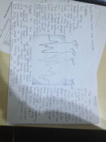
Idea 2 - Sound Wave/Heart Rate
The purpose of the design is something many people are familiar with weather they see it as a heart rate or a sound wave, this is good because when people see it in life they may be reminded of our company. The sound wave aspect is also closely linked to film.
As our film company is aimed at young people, the intent needs to be something that targets them. Sports and music are the most common interests for young people so we combined the two as this would give something for young people to connect with.
For the design, the ident has a plain background with faded green edges for a 3D effect. It then has green zig zag lines with a faint green glow around them which would track through the lines from left to right. After 3 runs of the green glow; Pal Productions would appear written in the lines.
For this ident I would first go into photo shop a make a Pal Productions logo that is in swirly writing, I would colour it green and it give it a lighter green shadow to give it a glow effect. I would then go into after effects and create a black solid for the back ground and add a drop shadow effect and change the colour to a green. Then using the shape tool I would create the zig zag lines along the screen. I would then make a new shape of slightly thicker lines but in a low transparency to give it a glow effect. I would then make a key frame at the start, following the original lines but making a new key frame on every corner so the second line appears to be following the original lines. I would repeat this twice more then import the photoshop file of Pal Productions.
Idea 3 - Bath tub
The quality of an ident before a film is clear indication of how good the film might be, it is crucial that your ident looks good so that your audience carry on watching and don't get put off. A music video we recently produced features a large amount of scenes in a bath, it is also key that your ident reflects your company so having similar idents to our production can keep the audience interested and keen to keep up with the company.
In intent in this ident features text with PAL Productions clear and centred, which is eye catching and doesn't have anything overlapping it so that the company name stands out.
As my first 2 ideas have been animation based I decided to try something featuring motion picture instead. This ident is of a bath with the taps dripping and causing a ripple affect, the company name would then appear at a low transparency to high transparency to appear as if coming from the water.
For this ident I would first film a bath tub with the taps dripping. I would use a tripod to ensure the image was still to look of professional quality. I would then import the video into after effects and add the writing using the text tool in a light blue. I would then add a kep frame and put the opacity to very low, I would then go along the timeline aprox 3 seconds and add another key frame and change to a high transparency so that it fades to be more bold. I would also add a faint shadow in lighter blue to make it stand out from the water.
Ident Text Ideas:
Friday, 13 December 2013

After effects - track motion

Friday, 29 November 2013
After Effects 3D Tracker

To make this 3D tracker, we dragged our footage into a new composition, we changed the workspace to motion tracker and added a 'Track Camera' Tracker.
We then added tracking text, made it 3D using the 3D effect box, duplicated it and added a 'Fast Blur' to the duplicated text to give it a 3D effect.
Friday, 22 November 2013


Photoshop Before and After 2


For this edit i used the healing brush and spot healing brush to change to change the appearance of the skin. I also used the colour replacement tool to change the eye and lip colour.
Photoshop Before and After
Before

After

I used a variety of Photoshop tools to change this picture. I used the Healing Brush tool to remove the spots and change the appearance of the skin on her cheeks, it blends the skin to remove blemishes. I then used the Spot Healing Brush tool remove the mole on her ear, this can be used on whole areas of the skin to cover specific blemishes. I then again used the Healing Brush tool to change the shape of her lips and the Colour Replacement tool to change the colour.
Friday, 8 November 2013


Subscribe to:
Posts (Atom)